Nando’s Grocery Refresh
Packaging Design
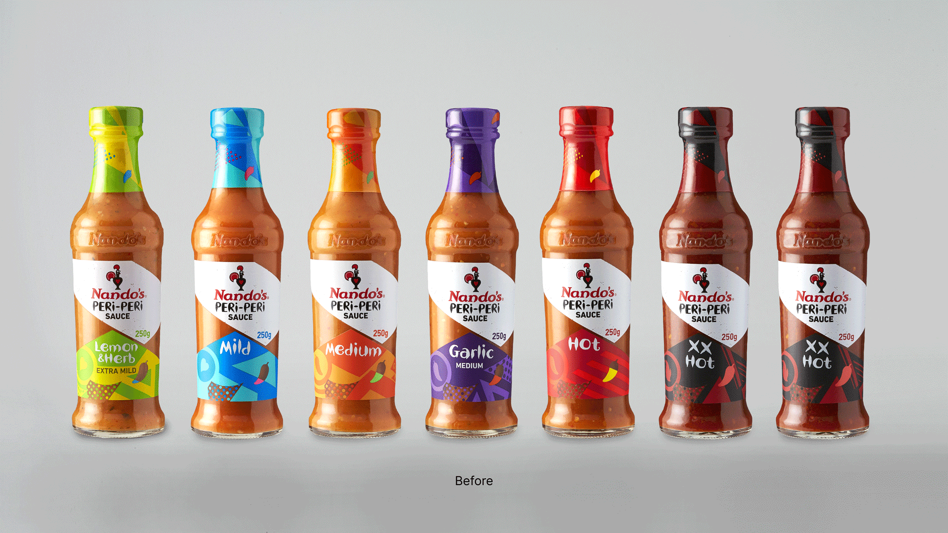
In 2016, the new Nando’s Grocery VI brought unique African energy – and a massive cultural shift – to the hot sauce and condiment category. But the audience evolved over time, so we needed to evolve with them.
-
Challenge
Category trends were leaning more towards food credibility; natural ingredient call-outs, food quality cues and cooking expertise had begun to dominate. Our job was to communicate those credentials, as well as make the packs easier to understand for shoppers who were struggling with comprehension – but without losing that young, joyful, Nando’s fire.Solution
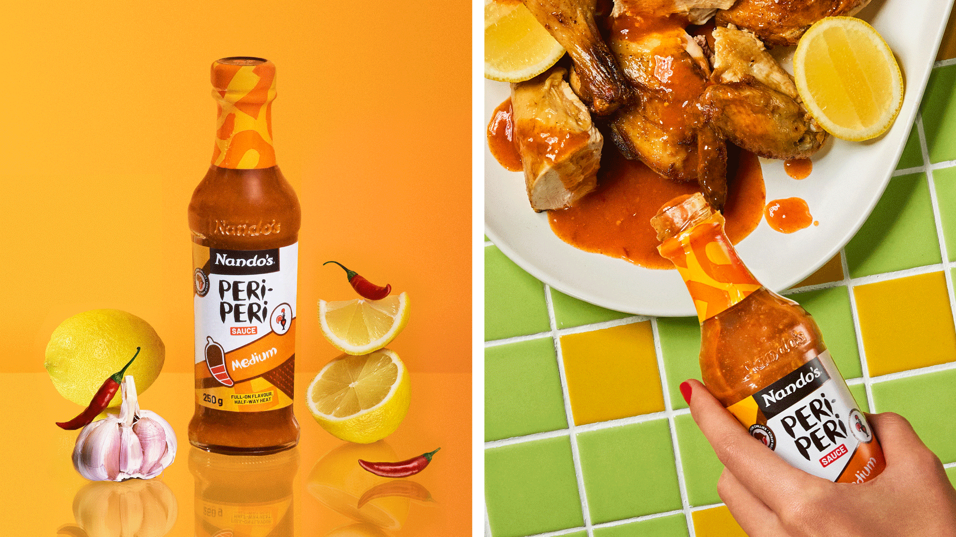
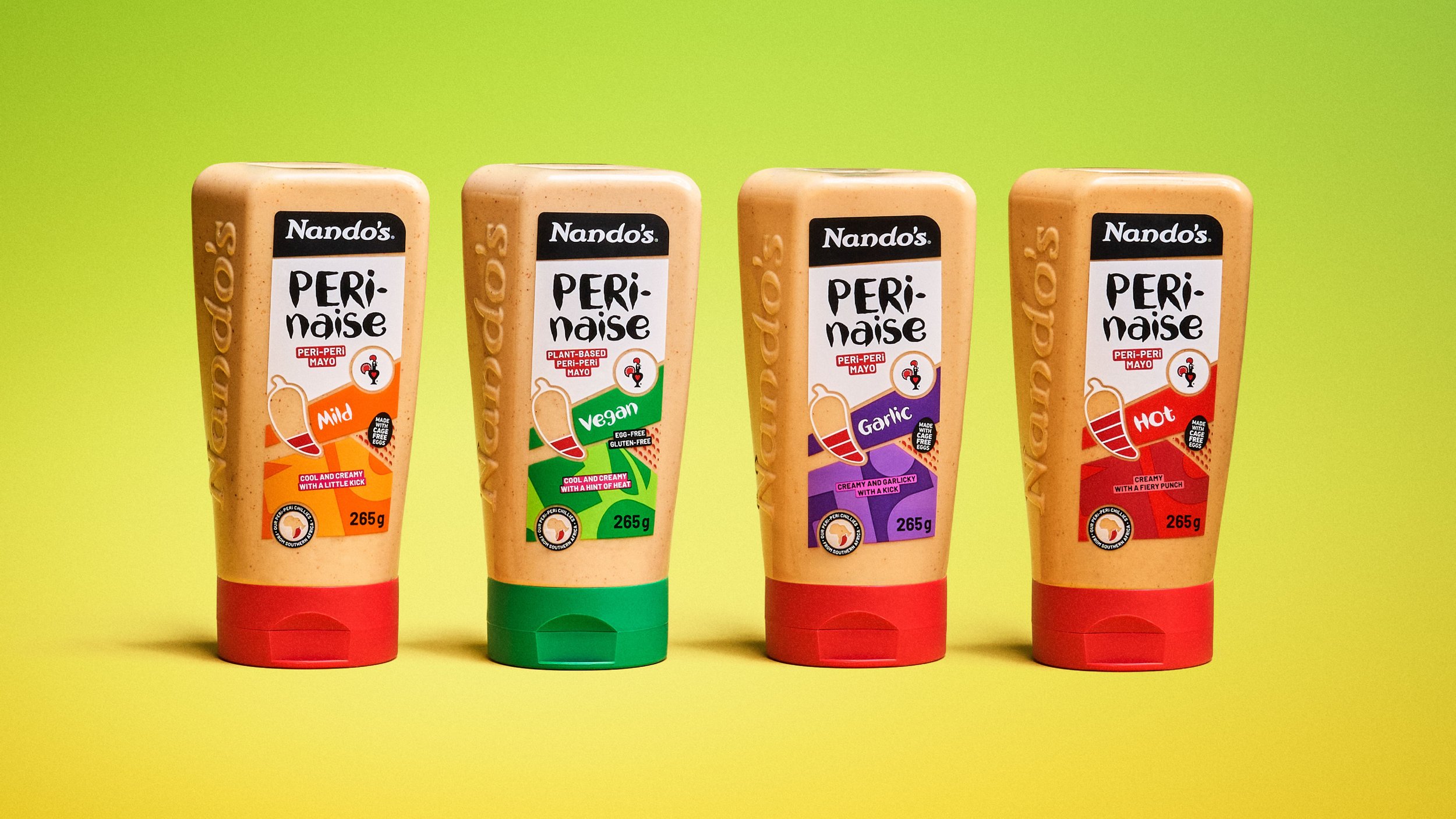
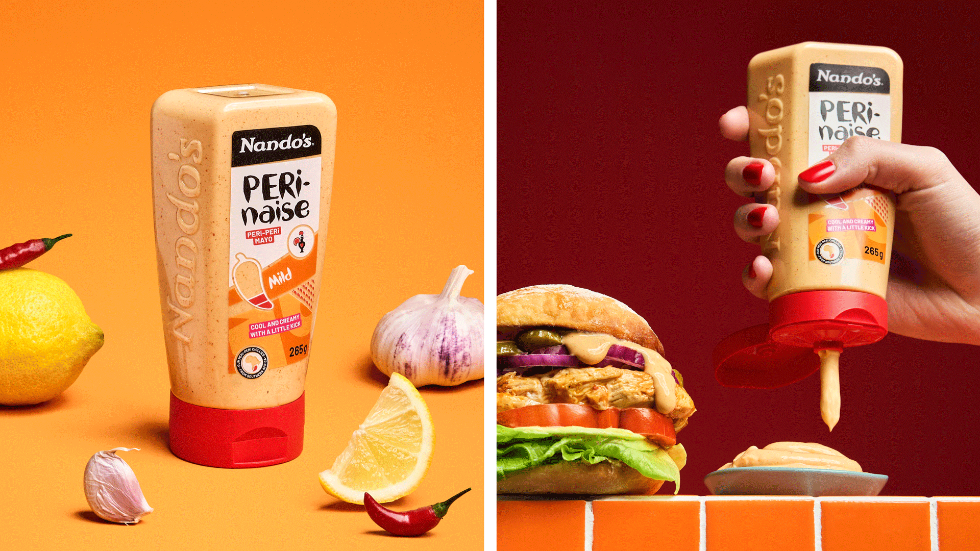
We eliminated shopper confusion by developing a clear messaging hierarchy. Amplifying Nando’s Hand, a distinct brand asset, helped us own PERi-PERi; adapting other assets led to greater comprehension around heat levels and more. We also designed a provenance icon, addressing both ingredient credentials and the brand’s origin story. Now, with a new PERi-PERi pattern and bold use of colour, the packs shout from the shelf – balancing category-fit functionality with Nando’s youthful, African energy.Impact
Nando’s recorded the highest volume growth among the UK’s top five table sauce brands, outperforming every major competitor.
The brand moved up to become
the third-largest table sauce brand in the UK, displacing HP.