Carling Black Label
Identity Design
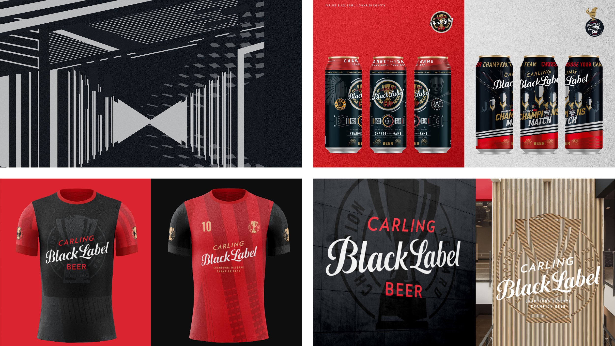
We came up with a new visual identity and packaging design philosophy for Carling Black Label that reflected a social shift.
-
Black Label’s always been the beer for champions. But today, being a champion means more than outdated stereotypes of manliness. That’s a great thing and to celebrate it we started thinking about what a beer that rewards inner champions could look like on the outside.
We made the iconic trophy a big focus, putting it front and centre as a symbol of customers’ achievements. Then, we split our design into three parts to show how the brand supports and celebrates a true champion's journey: the effort, the achievement, and the rewards.
Next, we figured out ways to use the new design style in different places like print ads, sponsorship spaces and 3D.
We put the brand’s purpose and story together in book form as well, which is used to welcome new stakeholders to the brand. It also shows how our audience has evolved over time, from physically hardworking breadwinners to men who stand up for women, and who see strength as something inside them.

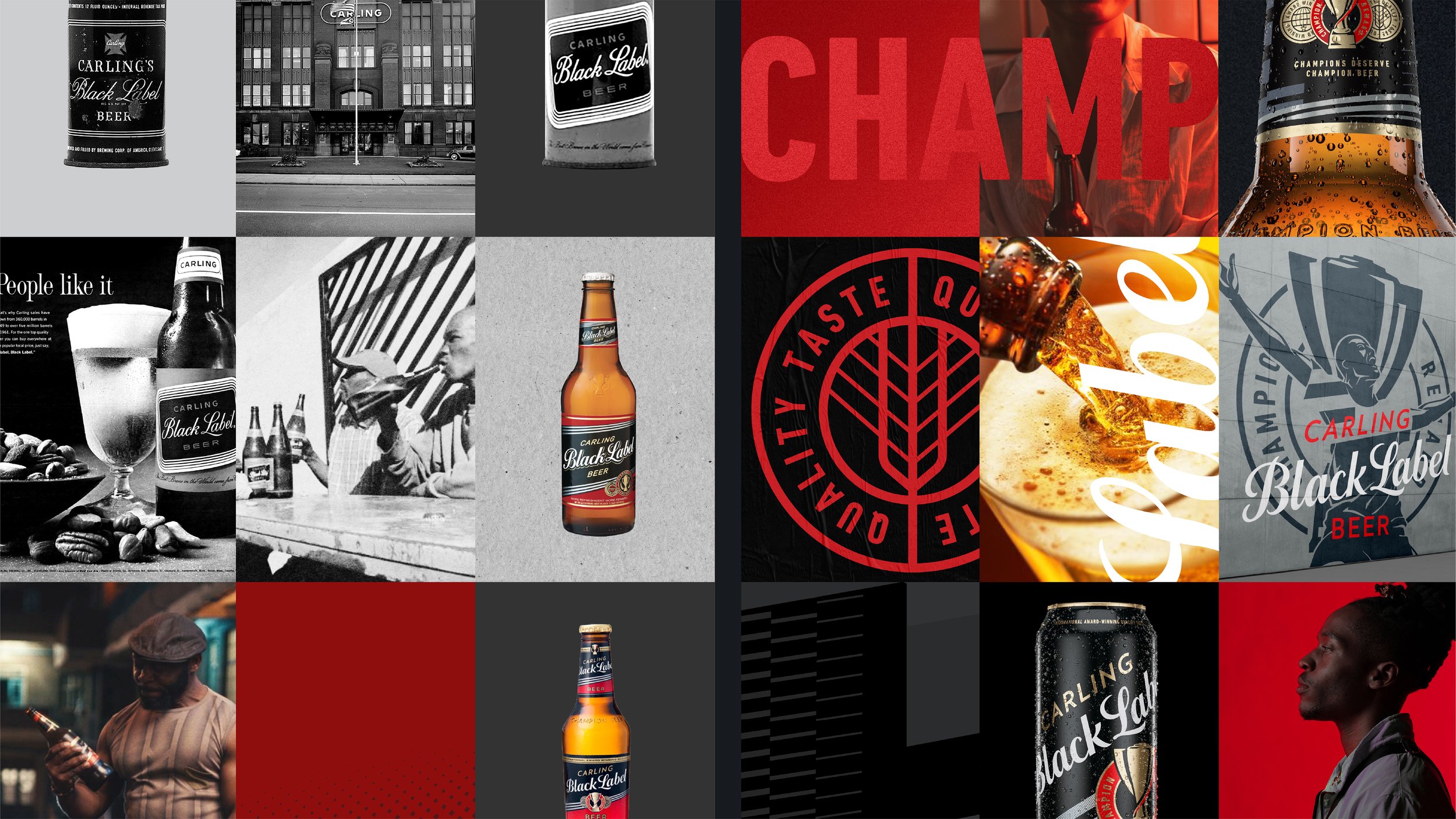

To start with, we elevated and centred the symbol of our consumers’ achievement; the iconic trophy.
Next, we broke our graphic system into three components that encapsulated the brand’s role in supporting and celebrating a true champion’s journey: Effort, Achievement, and Reward.
Our brand purpose and story found expression in book form, too; an emersion and onboarding resource that also tracks the evolution and aspirations of our working-class market from laboring heroes to nation builders, to entrepreneurs, to men who protect women, to men who see strength as an internal state of mind.
By affirming real Champions through our design approach, the VI works hard across communication platforms to promote the creation of new ones.